- Published on
Mastering Logo Design with Stable Diffusion: A Practical Guide
- Authors

- Name
- Albert Alam
Logo design has always been about more than just shapes and colors. It’s about storytelling, first impressions, and memorability. But generating multiple ideas quickly? That’s where Stable Diffusion steps in.
I remember my first session experimenting with AI logos—it was chaotic, messy, but also exhilarating. Within minutes, I had ten variations that might have taken me days to sketch by hand. Some were quirky, some were surprisingly elegant. The key was learning how to guide the AI rather than letting it wander.
Why Use Stable Diffusion for Logos?
Stable Diffusion brings speed and flexibility to a process that often stalls in the ideation phase. Some clear advantages:
- Rapid prototyping: Generate multiple concepts in minutes.
- Creative variation: Explore different aesthetics—from minimalist and flat to futuristic and abstract.
- Cost-effective experimentation: No need for expensive design software or long brainstorming sessions.
It’s important to understand the AI’s limits. Typography and extremely precise shapes can be tricky, so think of it as a partner for ideation rather than a full replacement.
Step-by-Step Workflow
Here’s a workflow that has consistently worked for me:
- Initial Concept Generation
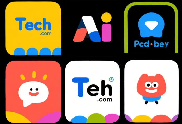
Start broad. For example: “playful tech company logo, flat vector style, bright colors, bold lines.”

Selection and Refinement
Pick the most promising outputs and refine them using img2img. Adjust prompts to emphasize balance, symmetry, or color harmony.Enrichment
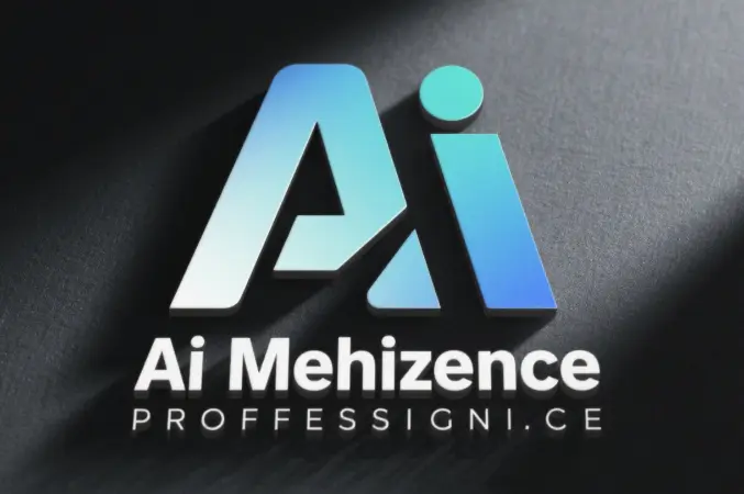
Enhance with textures, shadows, or subtle gradients to give depth and character. This is especially effective when presenting mockups to clients.

- Final Human Touch
Export to Illustrator or Figma for polishing. Ensure vector consistency, scalable typography, and legibility. AI gives you ideas; your expertise makes them usable.
Making the Content Work for Traffic
If you’re looking to boost visibility, documenting this process is gold. Potential topics include:
- AI logo design tutorials
- Workflow breakdowns with screenshots
- Before-and-after comparisons
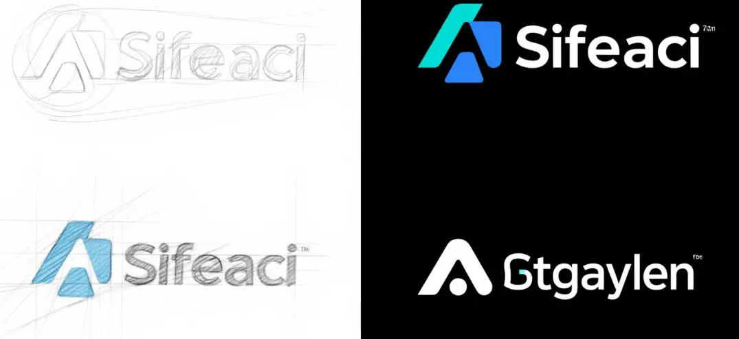
I’ve found that audiences are particularly drawn to iteration stories. Showing messy drafts and final polished logos builds authenticity. People want to see how the AI assisted, not just the end result.
Lessons Learned From My Experiments
- Prompt specificity matters: “Minimalist fox logo, vector style” works better than “cool logo.”
- Iterate in layers: Don’t try to get perfection in the first pass. Start rough, then refine.
- Test at multiple sizes: Logos must remain recognizable when scaled down.
- Add human context: Typography, alignment, and final polish are still crucial.
- Share your process: Case studies and blog posts attract more engagement than a single polished image.

My Take
Using Stable Diffusion has changed how I approach logo design. The creative bottleneck is no longer the initial idea but the refinement and storytelling. I feel like I have an endless sketchbook of concepts at my fingertips, which also translates into blog content that readers actually enjoy.
For designers, marketers, and content creators, this workflow opens up new opportunities: faster production, richer case studies, and more traffic from an engaged audience curious about AI-assisted design.